- Systematic review by BCPR-5 students published in Indian Journal of Psychological Medicine
- Systematic review by BCPR-5 students published in East Asian Archives of Psychiatry
- Get intimated when the enrollment begins for BCPR-7
- Systematic review by BCPR-5 students published in General Hospital Psychiatry
- Systematic review by BCPR-5 students published in The Journal of ECT
Blog
Stat-Art-Ics
Written by Dr. Sreya Mariyam Salim, an alumnus of BCPR-4.
Statistics, for me, had always been a daunting mix of numbers, equations, and incomprehensible ideas. However, through the classes of BCPR Season 4—most of them led by Dr. Denis Xavier—I began to uncover the stories hidden within statistics. With each session, chaotic equations transformed into meaningful patterns, and intimidating numbers wove themselves into compelling narratives.
This series of paintings is my artistic tribute to the course. I hope these artworks inspire learners to see the course not just as an academic pursuit but as a creative experience that encourages exploration and self-expression.
Seeking the diamond- The Forest plot
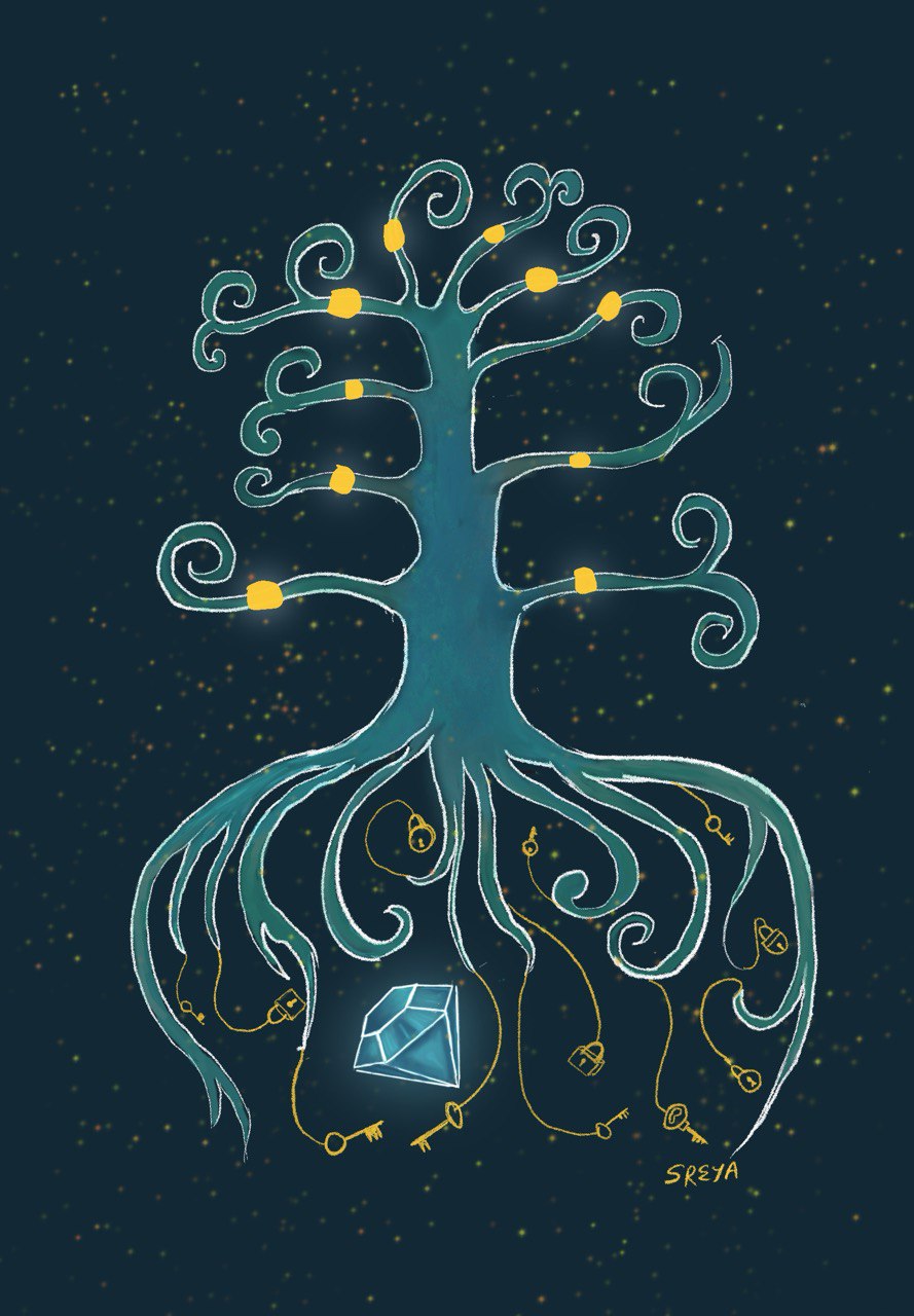
This drawing was inspired by the first online class of BCPR Season 4. Dr. Vikas Menon and Dr. Shahul Ameen eloquently explained the beauty of forest plots, which became the seed for this artwork.
The tree in the drawing bears gems on its branches, symbolizing the evidence from various studies. Yet, the true diamond lies deeper, locked away amidst the locks and keys of questions and answers. To me, this image encapsulates the essence of science: it is not about one question, one experience, or one experiment. It is about the cumulative and iterative journey of evidence, continually guiding us closer to the truth.
Scatter specks and the regression butterfly
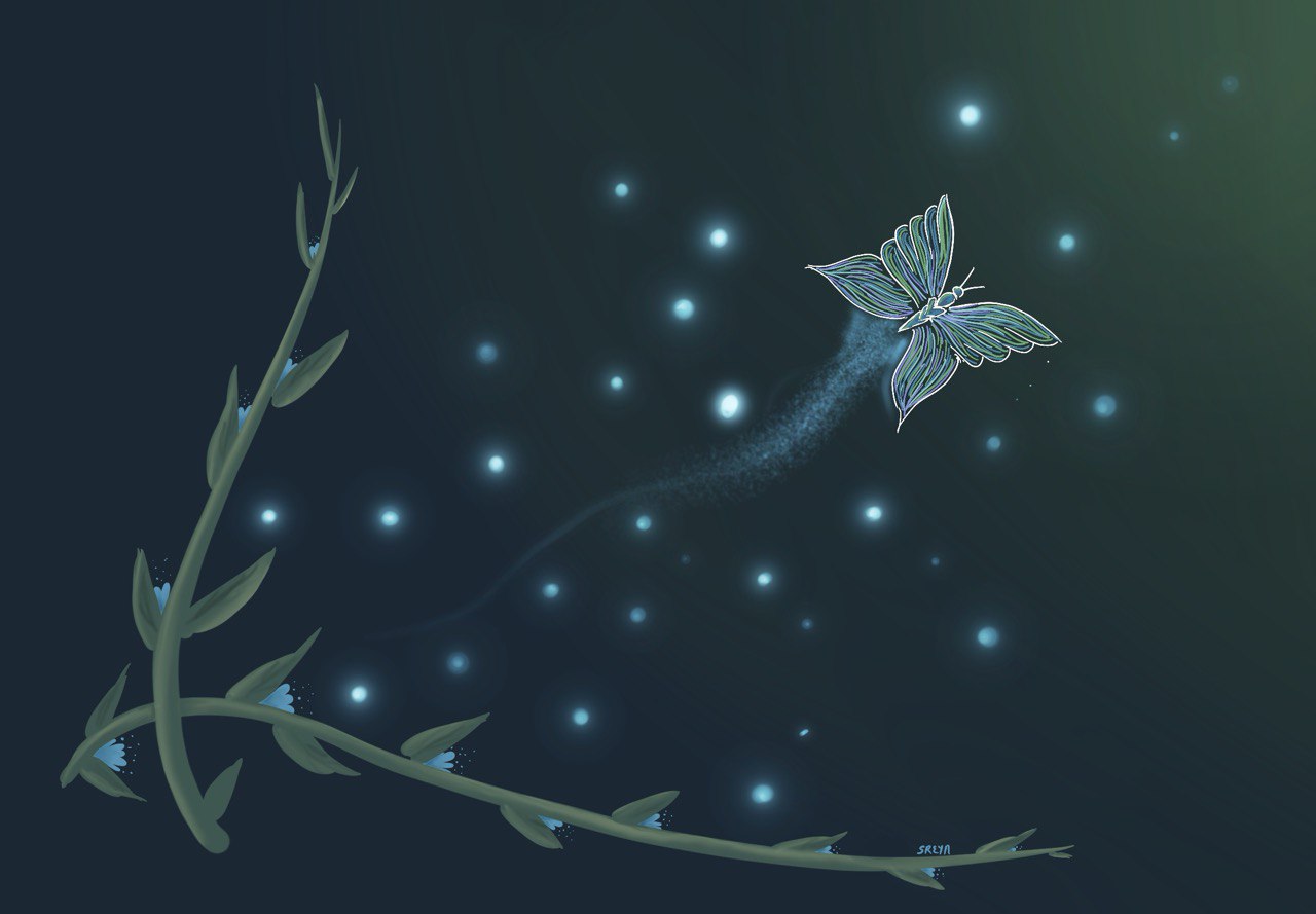
This picture was created when I could finally decipher the beauty of correlation and regression. It represents the illuminating patterns of the scatter plot, with the "regression butterfly" gracefully guiding us toward meaningful predictions.
Boats and whiskers
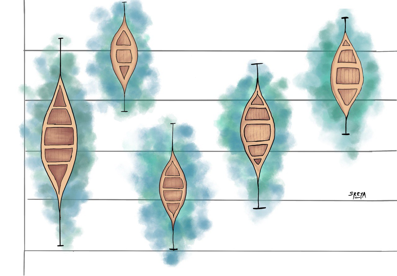
To any artist, a box-and-whisker plot offers endless visual possibilities. To me, the boxes and whiskers seemed to float, inspiring this reimagination where the boxes became boats, and the whiskers transformed into oars.
Living in literature- The Funnel plot
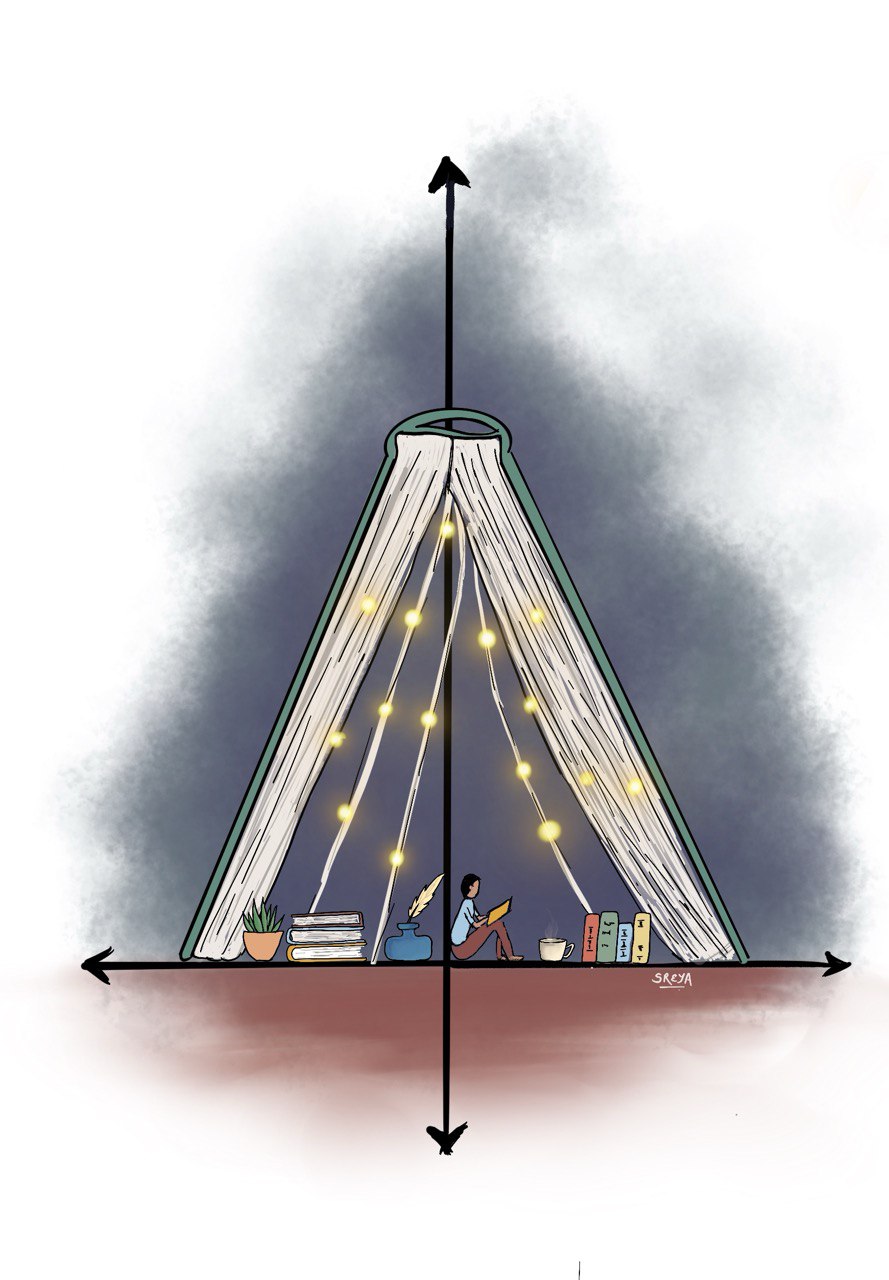
In this re-imagination, the funnel plot takes the shape of an inverted book, transforming into a cosy haven. Previous studies become sources of light, guiding further exploration and discovery. This artwork, titled Living in Literature, embodies the serenity and solace found in delving into evidence, where each study shines as a beacon, guiding future searches.
Brewing the optimum set of colours- The ROC curve
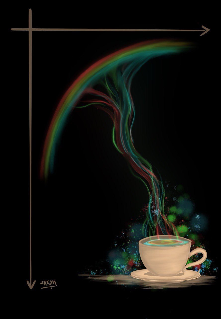
This artwork reimagines the ROC curve as a process of brewing the optimal balance in decision-making. The rainbow-coloured hues represent different possibilities, blending seamlessly to embody the ideal trade-off—just as the ROC curve achieves the perfect balance between sensitivity and specificity.
The Normal distribution
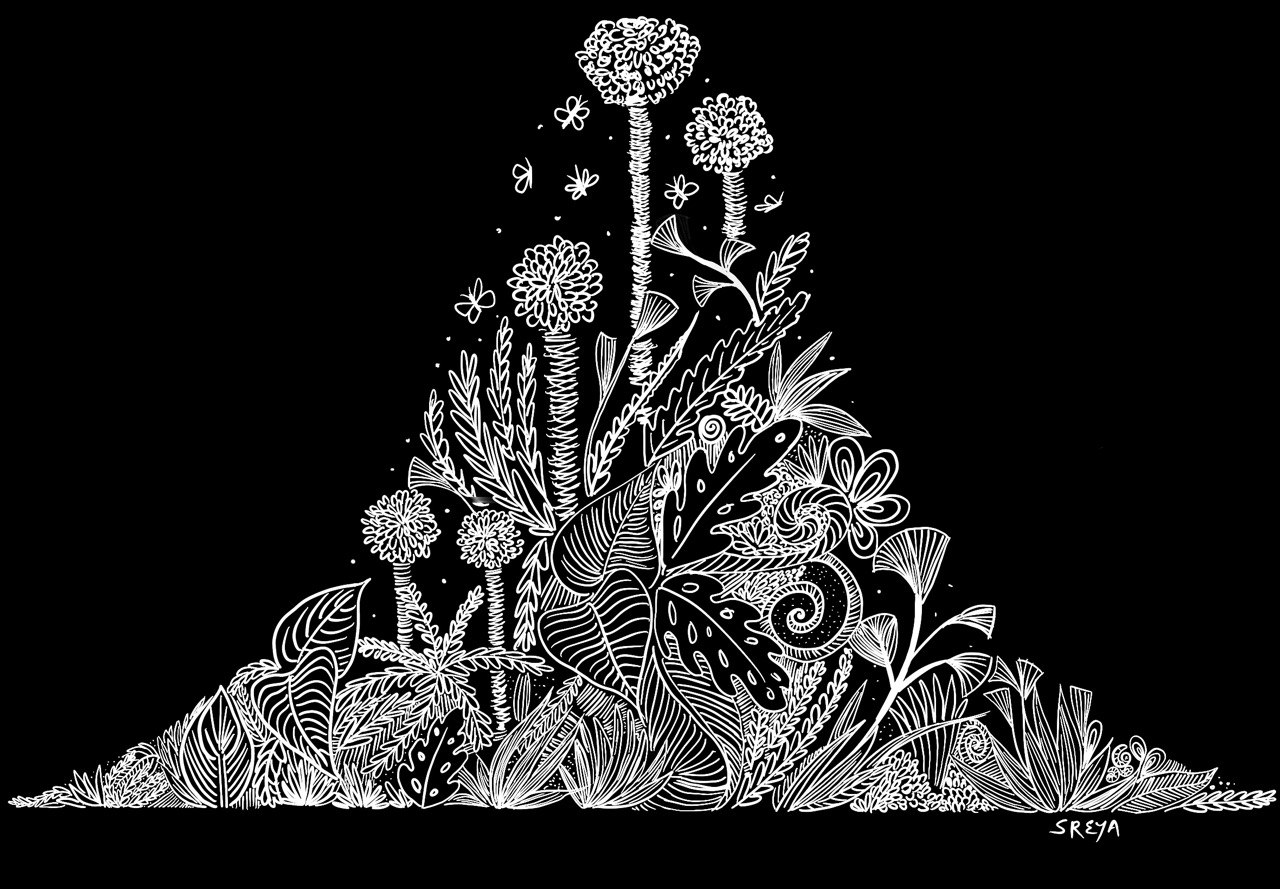
This doodle represents the normal distribution, likened to a forest—intricate, deep, diverse, and infinitely beautiful. It embodies harmony and complexity, mirroring nature's own balance and symmetry.
Marching to Normality- The QQ plot
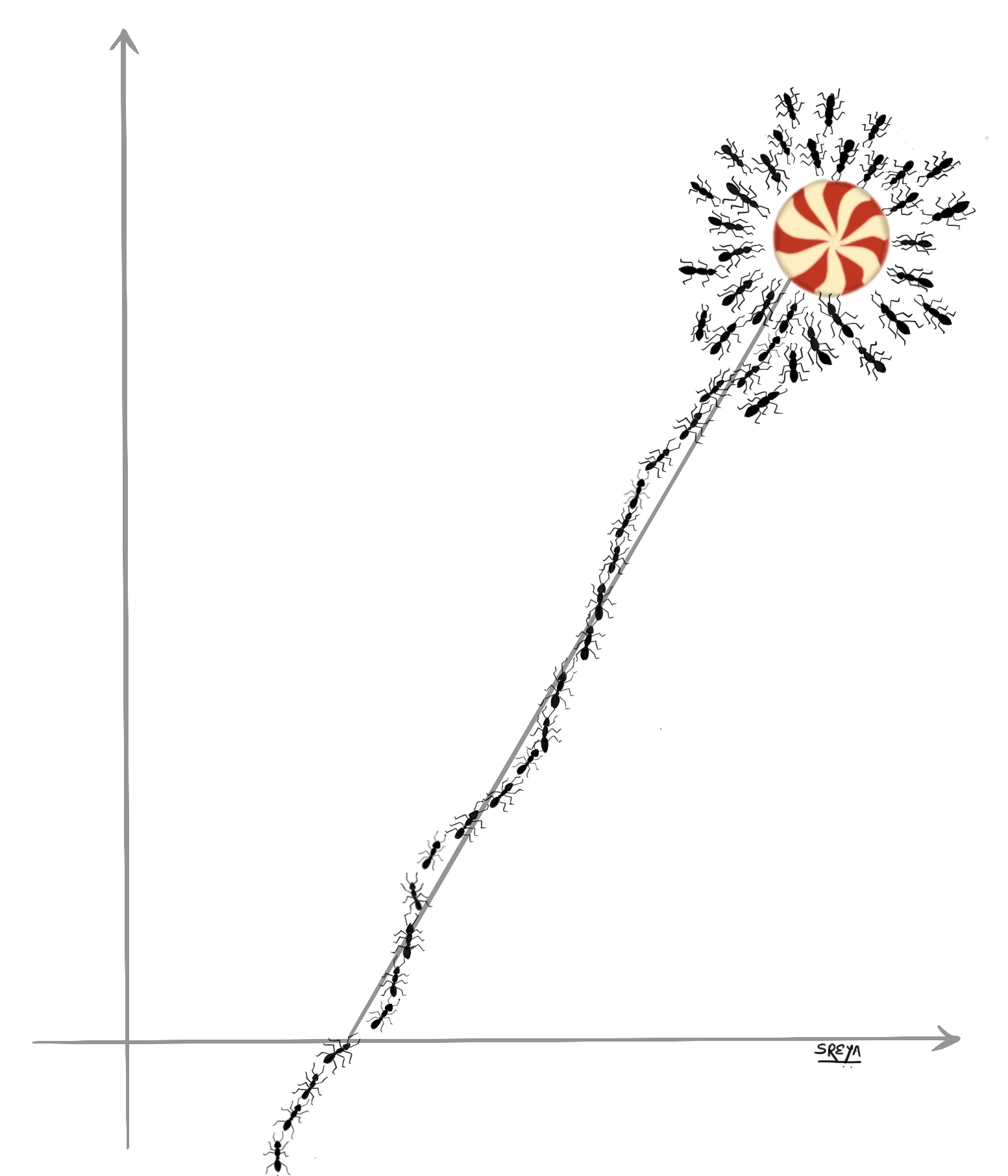
This picture reimagines the QQ plot as a trail of ants marching along the straight line of normality, converging on a sweet reward at the end. It symbolizes data points aligning to unveil insights, much like a QQ plot reveals the underlying distribution of data.
Flickers of Survival- The Kaplan Meir Curve

This artwork reimagines the Kaplan-Meier curve as a series of candles, each representing a point in time. The flickering flames symbolize survival, gradually diminishing over time. Much like the Kaplan-Meier curve, this picture captures the persistence and eventual ebb of outcomes across time.